3D sets
Table of Contents
3D sets are code elements that can be inserted into the scene instead of 3D objects. They are used when complex composite elements that form a unit and react like a single model are required. 3D sets can contain interaction elements, animations and audio clips. In addition, 3D sets can also interact with other elements in a scene.
Example:
- A plant on a pedestal: The height of the pedestal should be able to be changed. Here you can define in the 3D set that the height of the plinth can be changed. The plant always stands on the plinth and so only one height needs to be adjusted.
- A staircase: The number of steps and the height of the steps can be configured here.
- A canopy: This can consist of more than dozens of elements, the position of which can depend on the dimensions of the canopy.
- An animation with sounds: An animation is shown in which a cordless screwdriver tightens a screw. A sound is played.
3D sets are created with AFRAME (https://aframe.io) in the neo-code component. In addition to all the possibilities offered by AFRAME, many other components provided by vrdoro can be used.
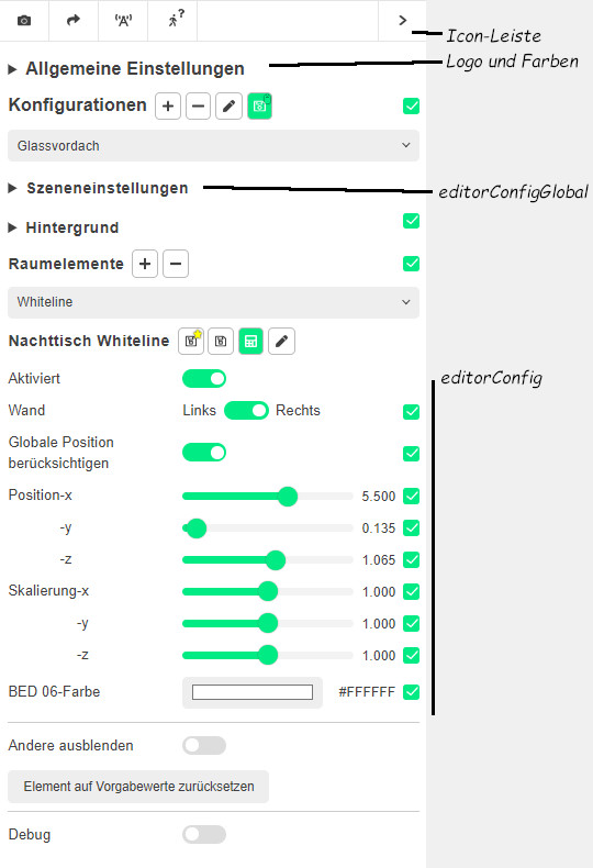
The UI with which the elements can be customised can be configured using an EditorConfig or EditorConfigGlobal attribute on each a-entity tag.
The syntax for the EditorConfig is very extensive and is explained using examples.
Overview
Parameters of the neo-code component
- <String>
nameName of the neo-code component - <Boolean>
enabled: Activates/deactivates the component - <String>
code: Selector for the code block to be executed (optional) - <Array>
params: Names of the parameters p0-p14 in consecutive order - <String>
p0…: Value of the respective parameter - <Number>
codeRunDelay: Delay in the execution of the code block - <Boolean>
updateShadowMap: Activates/deactivates an update of the shadowMap after execution of the code block
Parsing the parameter values
The default parameter type is string. Automated parsing takes place in the following cases:
- Value: 'true' or 'false' → Boolean
Boolean - Value: '123.45' (single numeric value) → Number
Number - Value: '0 1' (two numerical values separated by spaces) → Vector2
Vector2 - Value: '0 1 2' (three numerical values separated by spaces) → Vector3
Vector3 - Value: 'val1, val2, val3' (comma-separated values) or parameter name ends with '[]' →
array
Syntax of the editorConfig attribute
This syntax applies:
- The general syntax is:
editorConfig[Global]=`AttributeControl|[AttributeControl]*` - An AttributeControl has the form:
Attribute=Value rangeorComponentName=Property:Value range - Value range:
from~toorboolorcolourorselect
editorConfigGlobal vs. editorConfig
The controls defined by editorConfigGlobal are displayed in the upper 'Scene settings' section of the Room Viewer UI. The editorConfig values are displayed for the individual room element below Room elements.
Attributes vs. property
Values for properties such as position or colour are values for the corresponding entity attributes. The attributes can also be components, which in turn have attributes. These are then called properties (cf. the AFRAME docs). For example, the component material (set as an attribute on an a-entity) has the properties src and colour.
The configurable values and value ranges for the attributes and properties are generally handled in the same way via the editorConfig specifications. For example, a colour selection on an a-plane with colour=colour or on the material-component with material=colour:colour can be made selectable.
Attributes are generally referred to below, but the statements also generally apply to component properties.
Attribute value changes
There are different types of attribute values:
- Numeric values
- Boolean values
- Colour values
- Fixed values in a selection list
Numeric values
Numerical values are configured using a slider. The syntax is:
Attribute name=minValue~maxValue(stepWidth)(stepWidth) is optional, minValue and maxValue can also be vectors, e.g.Attribute name=minValue_x minValue_y minValue_z~minValue_x minValue_y minValue_z
minValue and maxValue can also be represented by - which means unlimited.
If minValue and maxValue are the same (the respective pair for vectors), no selection is possible and the value is fixed.
If the maxValue (not possible for vectors) is followed by a numerical value in brackets, this indicates the increment. For example count=1~10(1)means that only integers between 1 and 10 are possible.
Boolean values
Truth values (True or False) can be specified using bool as the value.
Example:
editorConfig=`visible=bool`
A checkbox is then displayed in the UI.
Colour values
Colour values can be changed by specifying colour as a value.
Example:
editorConfig=`backgroundcolor=colour`.
A colour selection element is then displayed in the UI.
Fixed values in a selection list
A selection list can be created by specifying the values within square brackets separated by commas.
Example:
animation=dur:[20000,10000,5000]- With display value (see below):
animation=dur:[20000~slow,10000~normal*,5000~fast]
A colour selection element is then displayed in the UI.
Buttons
Buttons can be added to call functions in the TemplateSnippet from within the editor. The syntax is: * functionName:button
This automatically creates a button with the function name in the editor. Clickplugin-autotooltip__default plugin-autotooltip_bigClick
Depending on the device, clicking is the user's action to select an element. On devices with a mouse, this means pointing at the element and pressing the left mouse button. For devices with a touchscreen, it is touching or touching and holding (iOS: long touch). In theing on the button calls the function.
Labels
Labels for UI elements can be added after the property separated by a tilde ('~'). The labels are specified in English. If there is a translation for the label in the dictionary, the word is translated into the respective language. For words separated by an underscore ('_'), the individual words are translated separately and the underscore is replaced by a space.
Example: functionName~Info:button~show
- functionName: Name of the function to be called up
- Info: Text before the button
- button: Type of definition (can also be bool or a value range (see below))
- show: Label text on the button
Translations
Unless explicitly specified, the label names are derived from the attribute names specified in the editorConfig.
Creation of translation keys
The formation of keys follows these rules (in the examples, the key is marked in bold after the ':'):
- A translation key is the attribute name of the attribute to be controlled: editorConfig='colour=colour'
- A key can be specified after '~' after the property: editorConfig='colour~primaryColour=colour'
- The keys for component properties are formed in this way:
light=intensity:0~2→ key = light-intensity
If the value range is a vector (e.g. for position or material.repeat), the key is followed by a '-' followed by x (y,…) is appended to the key in order to be able to address and control the values individually.
The room viewer checks for each label (getTranslationForKey(key)) to see if it can find a translation for it. There are two categories of translations:
- controller: Translations for standard control labels
- environment: Translations for room element labels
The check is performed in the specified order. This means that the translation of the standard control labels cannot be overwritten by element translations.
Note: Translation keys (as with the ember-intl used) must be used in a case-sensitive manner
Characters appended with an underscore '_' are removed when searching for a translation. The underscore is replaced by a space. This makes it possible to translate only the first substring.
Examples (string):
- Canopy_1 → Canopy 1 (the numbering is not part of the text to be translated)
- Bed_Whiteline → Bed Whiteline (Whiteline is a product name that is not translated)
Translation of Keys
The key is first checked in full (without the part after '_') and then shortened from the end to '-' to form a new key to be checked.
Example:
sun-position-xIf a translation is found, this is used. Otherwisesun-positionis used.sun-positionIf a translation is found, this will be used. It is supplemented by the missing suffix (x) for which a translation is also looked up.- And so on until the key cannot be shortened any further
Note: Translations cannot currently be added in the Visualiser. However, existing keys can be used.
Configuration examples
wallFlip- special function to rotate the object counterclockwise so that it fits to the other wall.
- Therefore all objects must first fit to the right wall.
scale- ⇒ scale in the default range of
'0 0 0~2 2 2
scale=0.5 0.5 0.5~2 2 2- Adjust the scale from 0 to 2 for x, y and z.
- The range
'0.5 0.5 0.5~2 2 2' can also be written as'0.5~2'.
scale=0~2- Adjust the values from 0 to 2 for x, y and z.
scale|position=0 2- Adjust the values for scale (with default values) and position from 0, 0, 0 to 0, 2, 2.
colour=colour;- Adjust the colour of the entity with a colour picker.
position=0~2|light=intensity:0~2;colour:coloring- Adjust the position, light.intensity and light.colour.
Example for controlling several values simultaneously (commented in the code with 'alias list'):
editorConfig=“scale[scale.x,scale.y,scale.z]~size=1~20”
Examples for changing materials with the component modeleffects:
modeleffects=“materials: Material001~facade={'colour':'#FFF'},Material002~frame={'colour':'#FFF'},Material006~glass={'opacity':0.5}”modeleffects=“materials: Material.015={'emissiveIntensity':0.6|'emissive':'#FF8'}”